
 Color and its emotional effect upon us plays a large part in setting the atmosphere of a home. It is capable of calming or agitating, uplifting or depressing, charming or boring, welcoming or repelling. Different colors excite different emotional responses, although some people are more sensitive than others and more responsive.
In home decoration yellow is indispensable, because more than any other color it gives the effect of light. Cheerful sunny yellow is an attention getter. While it is considered an optimistic color, people lose their tempers more often in yellow rooms, and babies will cry more. It is the most difficult color for the eye to take in, so it can be overpowering if overused. Yellow enhances concentration; no wonder legal pads are yellow. It also speeds metabolism. The modified yellows, such as buff, cream, ivory, beige, ecru, and pale lime yellow, are the most useful wall colors there are.
Orange is the brightest, most stimulating, and most decorative hue that exists. It possesses the qualities of both red and yellow, and in its pure state it is so warm that it should be used only in small quantities. It expresses energy, spirit, hope, courage, and cordiality. One of the most-used colors in decoration is orange in its neutralized forms, some of which are tan, peach, rust, cedar, and copper. These soft warm colors are highly desirable colors for living-room backgrounds, that is, ceilings, walls, and floor coverings. They radiate hospitality and cheer.
Brown is in vogue again after a period of unpopularity. Solid, reliable brown is the color of earth and is abundant in nature. Light brown implies genuineness while dark brown is similar to wood or leather. Brown can also be sad and wistful. Men are more apt to say brown is one of their favorite colors.
The most emotionally intense color, red stimulates a faster heartbeat and breathing. It is also the color of love. Red clothing gets noticed and makes the wearer appear heavier. Since it is an extreme color, red clothing might not help people in negotiations or confrontations. Red cars are popular targets for thieves. In decorating, red is usually used as an accent. Decorators say that red furniture should be perfect since it will attract attention. In decoration, red gives the impression of splendor, warmth, hospitality, and exhilaration. It is cheerful but not restful, and so must be used discreetly. The most romantic color, pink, is more tranquilizing. Sports teams sometimes paint the locker rooms used by opposing teams bright pink so their opponents will lose energy.
Purple is made of red and blue, which possess quite opposite characteristics and when mixed cancel each other’s effect, so that purple is somewhat gentle and vague. The color of royalty, purple connotes luxury, wealth, and sophistication. It is also feminine and romantic. However, because it is rare in nature, purple can appear artificial.
Magenta is the favorite color of modern decorators. It is a vivid red -purple and is extremely decorative. It is an exciting color, yet the purple element in it makes it mysterious and a bit restrained. It is particularly good with purple and vermilion, its neighbors. When using magenta in decoration it is well to have it in small areas such as flowers.
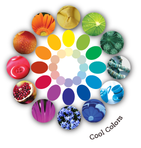
Blue is one of the most popular colors as it is found all around us as it is the color of the sky and the ocean. It causes the opposite reaction as red. Peaceful, tranquil blue causes the body to produce calming chemicals, so it is often used in bedrooms. Blue can also be cold and depressing. Fashion consultants recommend wearing blue to job interviews because it symbolizes loyalty. People are more productive in blue rooms. Studies show weightlifters are able to handle heavier weights in blue gyms. In decoration it acts as a check or an antidote for too much warmth. However, it tends to separate distinctly whatever colored objects are placed against it and so is valuable in a display window. Blues are not as friendly with one another as other colors are, and therefore have to be selected with additional care under both daylight and artificial light. Since blue is not an aggressive color, it does not have to be neutralized as much as some of the other colors.
Currently the most popular decorating color, green symbolizes nature. It is the easiest color on the eye and can improve vision. It is a calming, refreshing color. People waiting to appear on TV sit in “green rooms” to relax. Hospitals often use green because it relaxes patients. Brides in the Middle Ages wore green to symbolize fertility. Dark green is masculine, conservative, and implies wealth. Green is the color of grass, leaves, and vegetables and naturally suggests rest, cool shade, and refreshment-all pleasant things. Green is considered beneficial to the eyes, nerves, and disposition, because it is cheerful yet calming, and invigorating although restful. Since it is composed of yellow and blue, one warm and one cool color, it may be used with cool or warm schemes, as it appears warm if enough yellow is added or cool if more blue is added. There is such a large variety of usable greens that it is possible to find one that is harmonious with any scheme. Green is a good background color. Green ceilings or walls are likely to reflect an unbecoming color on the occupants of the room; however, pale green walls are often used to create the feeling of relaxation.
Black, white, and gray are the only pure neutrals. Generally speaking, however, the term neutral refers not only to these, but also to all the tans, beiges, sand colors, and browns that have no very definite color of their own.
Black is the color of authority and power. It is popular in fashion because it makes people appear thinner. It is also stylish and timeless. Black can be used to good advantage with dark colors, but in a light color scheme it gives too much contrast and makes other colors appear faded. Black is mournful if used in large areas, but accents of it are smart. Brides wear white to symbolize innocence and purity.
White reflects light and is considered a summer color. White is popular in decorating and in fashion because it is light, neutral, and goes with everything. However, white shows dirt and is therefore more difficult to keep clean than other colors. Large quantities of white suggest the cool cleanliness of hospitals. In small amounts it brings a cheerful sparkle to a room. Pure white is best with cool colors, but creams or off-white colors are more harmonious in warm schemes. As no more powerful contrast is possible than black and white, it should be handled with care. Black and white floors should be used only in palatial rooms that require ornamental floors because of their size and emptiness.
Gray is produced by mixing black and white, or by mixing complements. In either case it is the result of fusing opposites and therefore has no particular character of its own, except that in light tints it is gentle and serene, and in dark shades it is sober, gloomy, and dignified. Grays may be warm or cool. A pale warm gray containing either yellow or violet makes an acceptable wall color with gray or painted furniture and woodwork, but is out of key with brown woods. A dark gray wall that would make a suitable background for etchings or drawings can be made by glazing a dark gray over a white wall and stippling. Gray-stained wood in doors and furniture is more unusual than brown, and is pleasant where a cool effect is desired. It prevents the exchange of furniture between rooms, however, unless all one’s wooden furniture is gray or painted. A dominance of gray in a home too often indicates a lack of imagination on the part of the owner.
Next Post
The information on this website is provided exclusively for consumers' personal, non-commercial use and may not be used for any purpose other than to identify prospective properties consumers may be interested in purchasing. Equal Housing Opportunity: All real estate advertised herein is subject to the Fair Housing Act of 1968.
POPULAR SEARCHES
USVI Residential Rentals USVI Condos for Sale USVI Luxury Real Estate Homes Under $300,000 St. Thomas Waterfront Homes St. Thomas Real Estate Rentals St. Thomas USVI Condos for Sale St. John Waterfront Homes St. John USVI Condos for Sale St. Croix Real Estate Rentals St. Croix USVI Condos for Sale St. Croix Waterfront Luxury Homes Search Florida PropertiesPOPULAR AREAS
Peterborg St. Thomas Real Estate Red Hook St. Thomas Real Estate Ritz Carlton St. Thomas Mahogany Run St. Thomas Real Estate Secret Harbor St. Thomas Real Estate Chocolate Hole St. John Real Estate Cruz Bay St. John Real Estate St. John Map Christiansted St Croix Real Estate East End St Croix Real Estate5328 Yacht Haven Grande
St. Thomas, VI 00802
O: 340.774.5277 F: 340.777.9472
7 King Street, Christiansted
St. Croix, VI 00820
O: 340.715.7772
© 2025 Sea Glass Properties, All Rights Reserved. Powered by Neutrino, Inc. Privacy Policy Terms and Conditions Sitemap
Sign In
Sign in with Facebook Sign in with GoogleCreate an account
Create an Account
Sign up with Facebook Sign up with GoogleAlready have an account? Sign in.
By joining you agree to our Terms of Use and Privacy Policy
International Partners